Renovation Diaries | Kitchen Planning and Design
The kitchen is often seen as the heart of the home, and this will definitely be a high traffic area for us when we’re back in. The new kitchen area will be seeing some of the biggest changes in our home and we’re hoping our plans will make this place both functional for our needs and obviously ~beautiful~. Fingers crossed it’ll be the best of both worlds.
There wasn’t really much of anything wrong with our kitchen layout and if we had to just give it a little cosmetic upgrade, that could’ve worked as well. Our previous kitchen was a sort of galley kitchen with a little dining area at the end. If you missed my last post, you might know that our home was previously a rental and there were definitely aspects of the kitchen where you could tell. If you looked closely, you could see all the issues with the cabinets - both the fronts and the interiors. The previous owner also did a white glaze over the old tiles which looked beautiful at first, but started chipping during the two years we lived in it. Appliance were old (and partially malfunctioning), and the layout just wasn’t ideal for how we wanted to use it. We love to host our families and the small dining area didn’t work for us.
Our home had a formal dining area which we didn’t exactly need or use for dining purposes. Since it’s just the two of us for the most part, we didn’t want to use such a central part of our home to “store” a large table all the time. In our remodel plans, we ended up pushing our kitchen wall back into that existing formal dining area to give us a larger and slightly open concept kitchen area. We also bumped the other wall of our existing kitchen further into our old backyard to give us a new designated dining area.
Having lived in a few apartments and growing up in homes with varying kitchen styles, we were able to try out quite a few different kitchen layouts and really know how we felt about them. We had quite a few wishlist items and were quite happy to get most of them integrated.
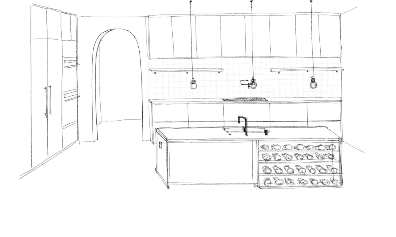
We wanted our stove against the wall so we could have an exhaust fan above it. We weren’t a fan of stoves on islands with downward exhausts.
We wanted our oven to be on a separate wall from the stove which is out of the way for the most part. That way if we’re cooking on the stove, someone can easily check on the oven without having to move out of the way of the stove. (Very much with hosting in mind.) We both also grew up in homes with a separate oven from the stove and it’s just a preference for us (also we rarely use our oven lol).
We wanted our sink to be on the island. Easier to pile up dishes on the island during cleanup and we can still talk to one another (or guests) while cleaning up. It’s also nicer to look out when washing dishes than staring ahead at a wall. (Extra perk: you can prop up your iPad or laptop to watch some shows as you’re cleaning up or prepping food with plenty of clearance.) We also find it easier to prep food with lots of counter space around. We would also both be able to prep on either side of the sink as needed.
A wishlist item for us was definitely to have integrated appliances where applicable. For those not familiar, that is where the appliances have cabinet looking fronts to blend in with the rest of the cabinetry. We compromised on this one as we wanted a column fridge/freezer to really give that fully integrated cabinet look, but ultimately it was out of our price range and this was where we had to cut during budgeting. We ended up adjusting from our initial plans and still went for an integrated fridge, but with a French door fridge and pull out drawer instead. We were able to keep an integrated dishwasher and opted for a double drawer style. (Since it’s just the two of us, we often have very few dishes so smaller loads seemed more practical for our day to day use.)
Cabinetry wise we preferred drawers where possible. It’s just easier to reach everything we need without having to dig through to the back of a deep cabinet. (I also find it easier to remove things and clean the drawers out every once in a while.) We were able to get drawers along our entire stove wall as well as our island. Inside of the cabinets along the oven wall, there are door openings but drawers and shelves for most of the interiors.
One of my Pinterest inspired cabinetry wishes was a larder style pantry. We were able to implement this and it’ll have a nice efficient use of storage while keeping everything nice and tidy behind closed doors.
As an avid coffee/tea drinker, my wish was to have a little coffee bar. All the way to the left of the cabinet wall I will have my very wish. We’ve set up a water line hook up so I can eventually get an espresso machine and finally learn latte art. I’ll also be able to put all of my beautiful mugs out on display here. I’m also going to find a way to aesthetically lay out all of our tea options for when guests come over.
T is an avid wine drinker and we wanted a nice way for him to store his collection but also have it out on display. I’ve always loved the way wine collections look and we’re happy to have it as a focal area on our kitchen island.
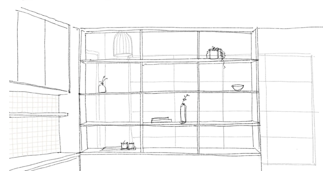
I love my pottery and having things out on display, so we’ve put together a few little nooks around the kitchen where I’ll be able to display some of our cuter items (i.e. cookbooks, dishware, etc.)
Just a note that the sketches were part of our first iteration and aren’t our finalized versions (but they’re very close)!
Materials
Material wise we are going with a soft and neutral palette.
We’re going with an engineered hardwood in a beautiful white oak. This will go throughout the house (aside from bathrooms) so we wanted a soft palette to compliment that. We have corresponding custom cabinetry in another white oak shade. We picked out some lovely hardware for our cabinetry from Mi & Gei, which we were lucky to score on sale during their Black Friday sale. (I’ve been watching the brand for a while and I notice they often have sales, so hold out for that if you’re interested!) The Mi & Gei pieces have an organic shape to these which I think go with the wabi sabi vibe I want for our home.
For our counters we have a very soft light concrete look counter (Caesarstone Fresh Concrete). These compliment our cabinets and also give a calming presence to the house. I like that they aren’t pulling too gray or too white, it’s a perfect middle balance. For our tile, the one we originally chose from Heath Ceramics was discontinued, but we were able to get one similar from Heath Ceramics in the color ‘Oat’. It’s the perfect shade as it reminds me of an oat milk latte. It also has tiny specks in the clay body which is something I personally love and it adds an earthy touch to the look.
Dining Area
While not completely part of the planning for our kitchen, I do have some current plans for our new dining area of my own. While I’ve loved my round dining table that we’ve had for 4+ years, it’s not the most ideal for hosting our families. I’ve been loving the look of rectangular tables and I think it’ll fit our new space well. It’ll be fine for our regular use but also perfect for hosting others over, game nights, and work dates with friends. I spotted this dining table from Sundays Furniture maybe two years back and that was one of the first pieces I had in mind for our home post remodel. I would plan to have the matching bench on one side and the my Breuer chairs on the opposite side. I’m also eyeing a pair of these Hay Design Rey Chairs in Golden (but these will probably be an addition a lot further down the line). Easy access to sit and less clunky than having chairs all the way around is my vision for this space. I’ve always loved the look of slightly mismatched seating. Above our dining area will be a lighting option that I’ve dreamt of for quite a while! We opted for the Herman Miller Nelson Saucer Bubble Pendant. It’s definitely a statement piece and it’ll tie in the look of this whole area.
Overall the space is starting to take form and I can’t wait to see how it looks with more progress!
Interior Designer: @CathieHongInteriors (sketches + materials sourcing)
Architect: @StoryBuildDesign


